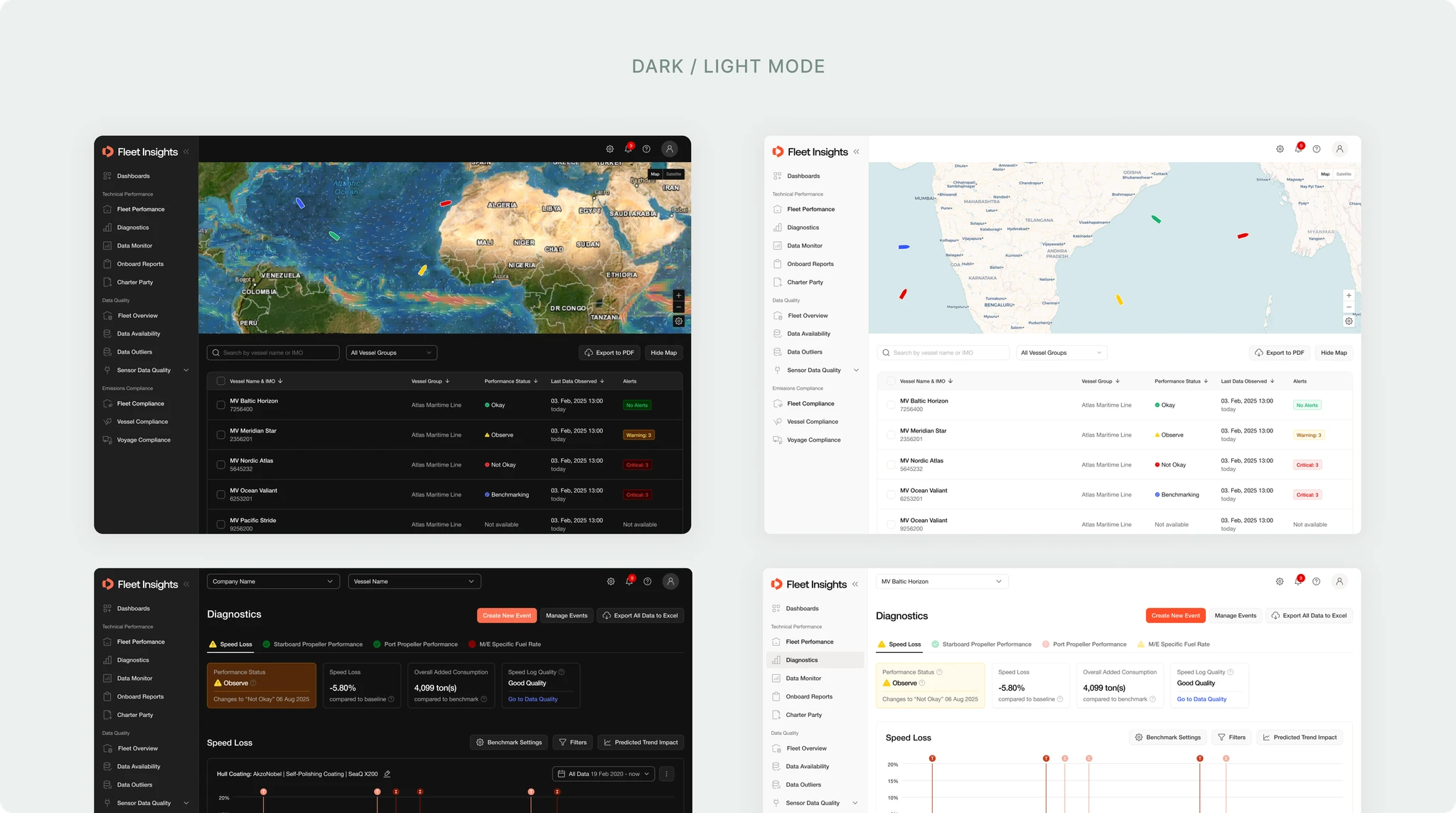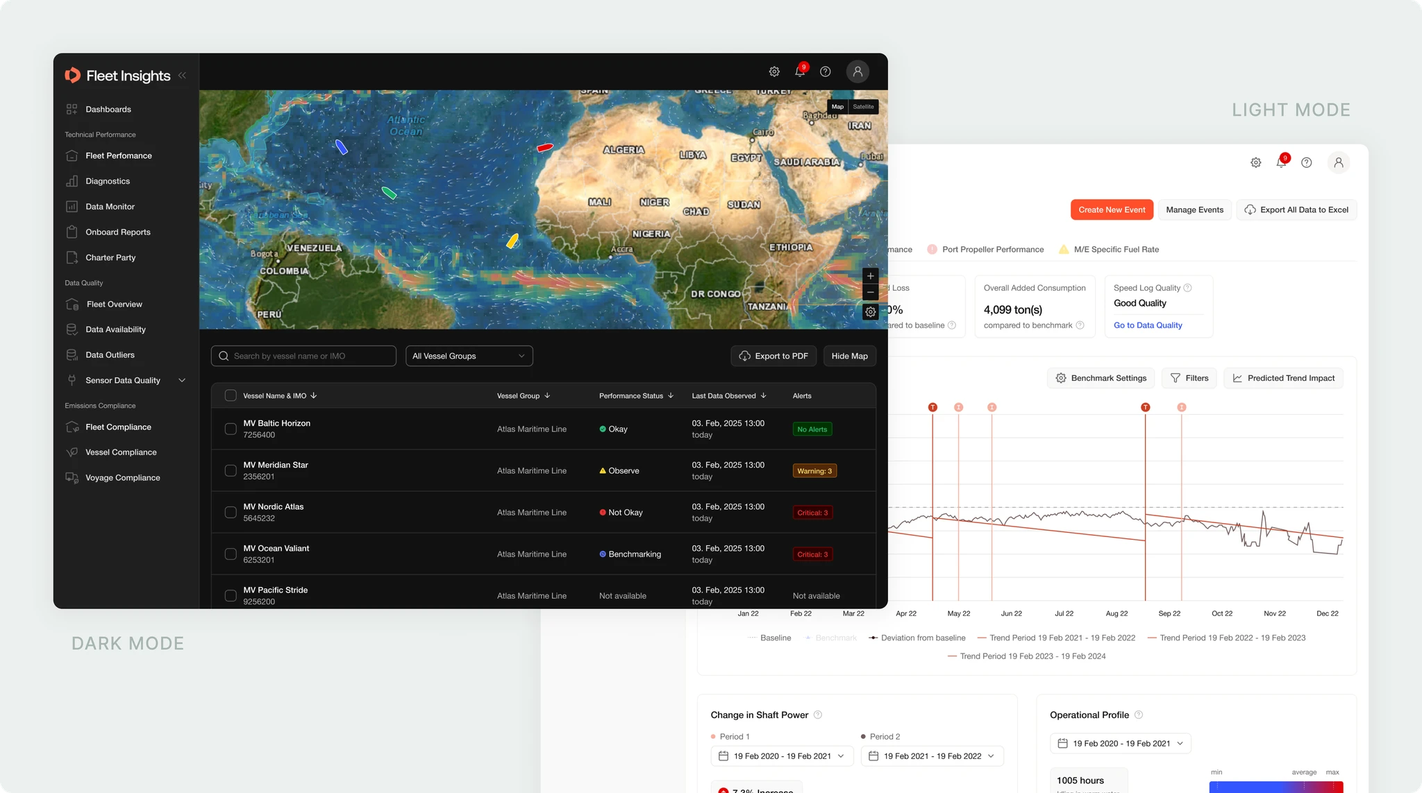
Fleet Insights is Danelec's platform for fleet operators monitoring fuel consumption, vessel performance, and operational efficiency across large fleets.
My role was to redesign the experience end-to-end: rethink the information architecture, improve navigation, bring related workflows closer together, adapt the new brand to a data-heavy interface, and introduce Danelec's first structured user research process for the product.
Fleet Insights is used by expert users: fleet managers, performance teams, and marine engineers. They do not need the product to be simplified in a consumer-product sense. They need fast access to precise data, clear hierarchy, and confidence that important information is not hidden.
The challenge was to make the platform easier to navigate without reducing the depth users relied on.
At the same time, the redesign had to work within several constraints:
Introduced structured user research
Before this project, Fleet Insights did not have a formal research process. I ran structured interviews with fleet managers to validate navigation assumptions and uncover workflow patterns that were not documented internally.
This helped move stakeholder discussions away from personal opinions and toward evidence from users.
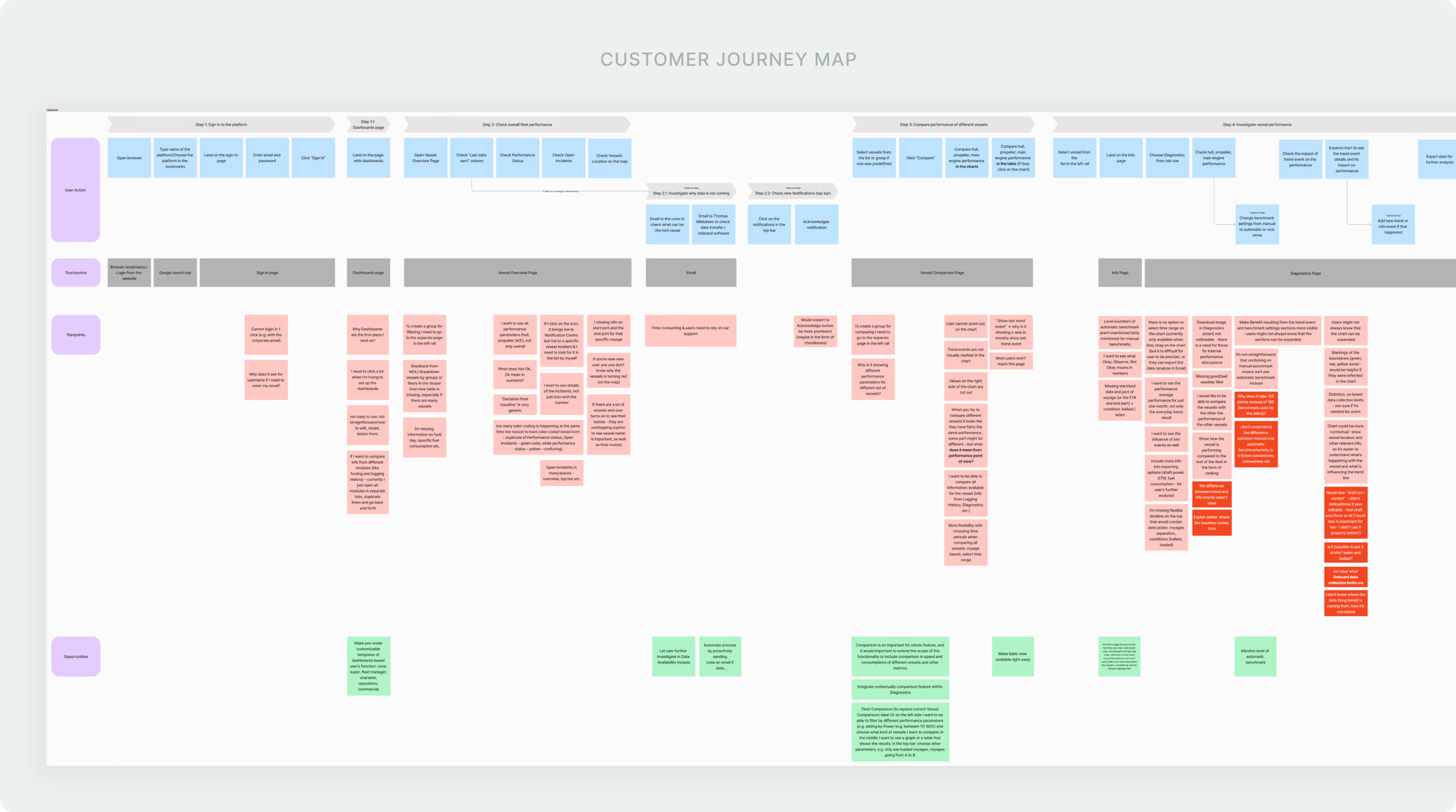
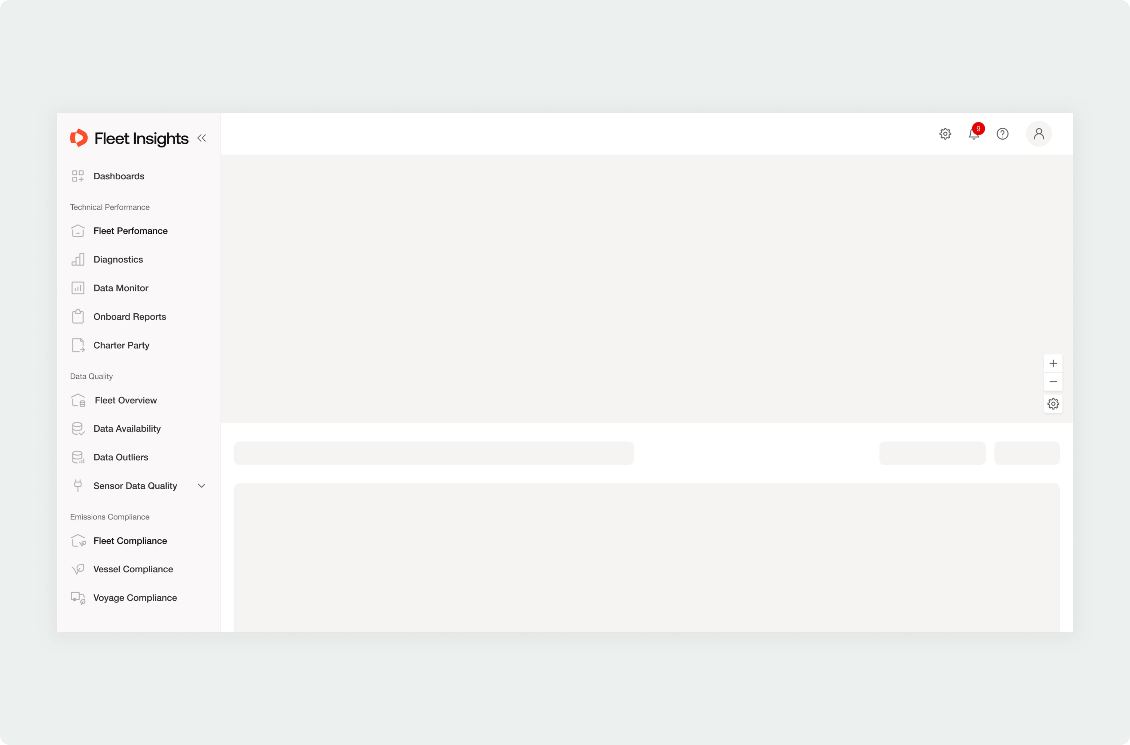
Rebuilt navigation around user tasks
I mapped the main jobs users came to Fleet Insights to do: monitor fleet health, investigate vessel issues, and track performance problems.
The goal was not to remove functionality, but to reduce the number of decisions users had to make before reaching relevant data.
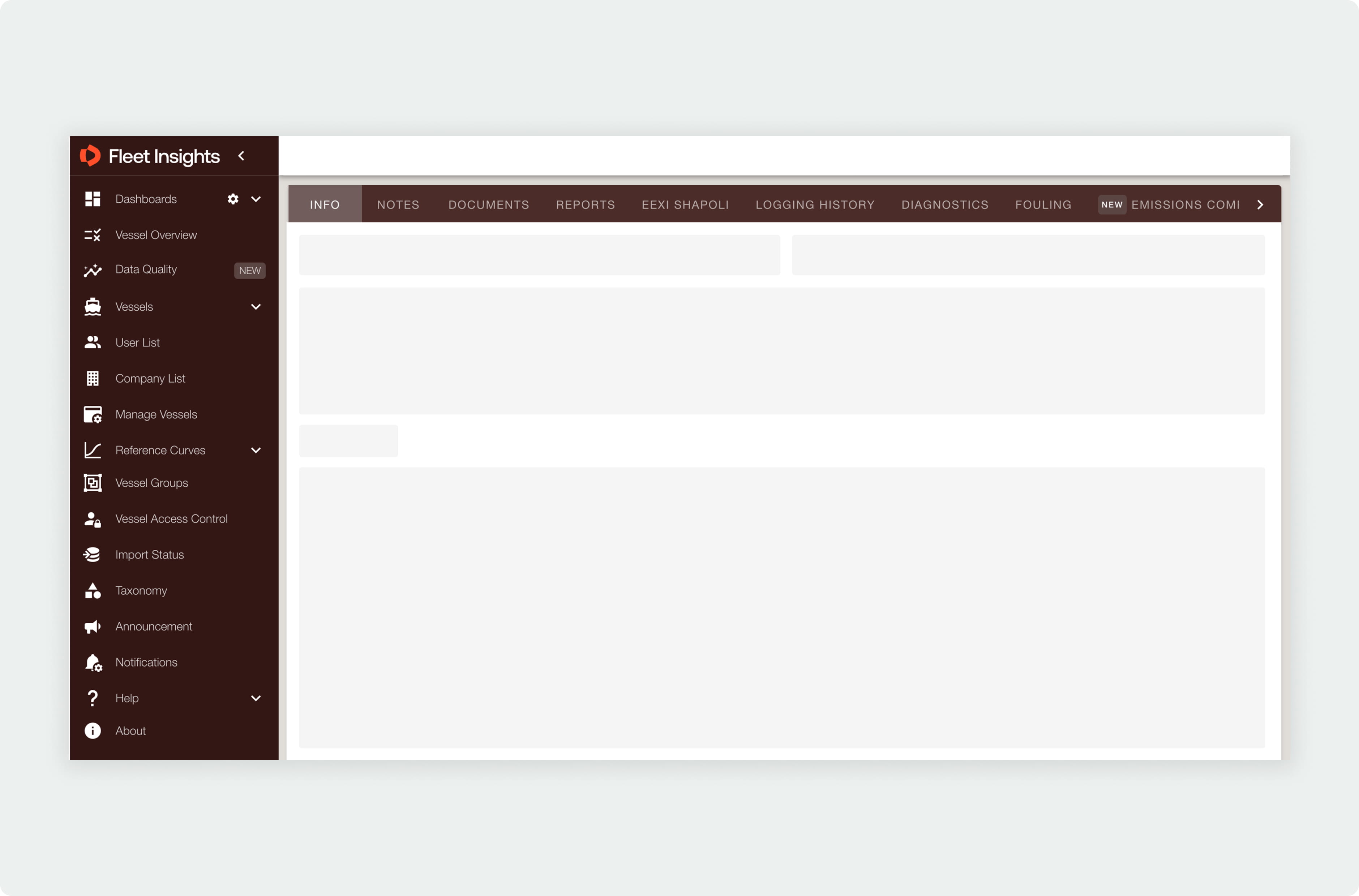
Unified related workflows
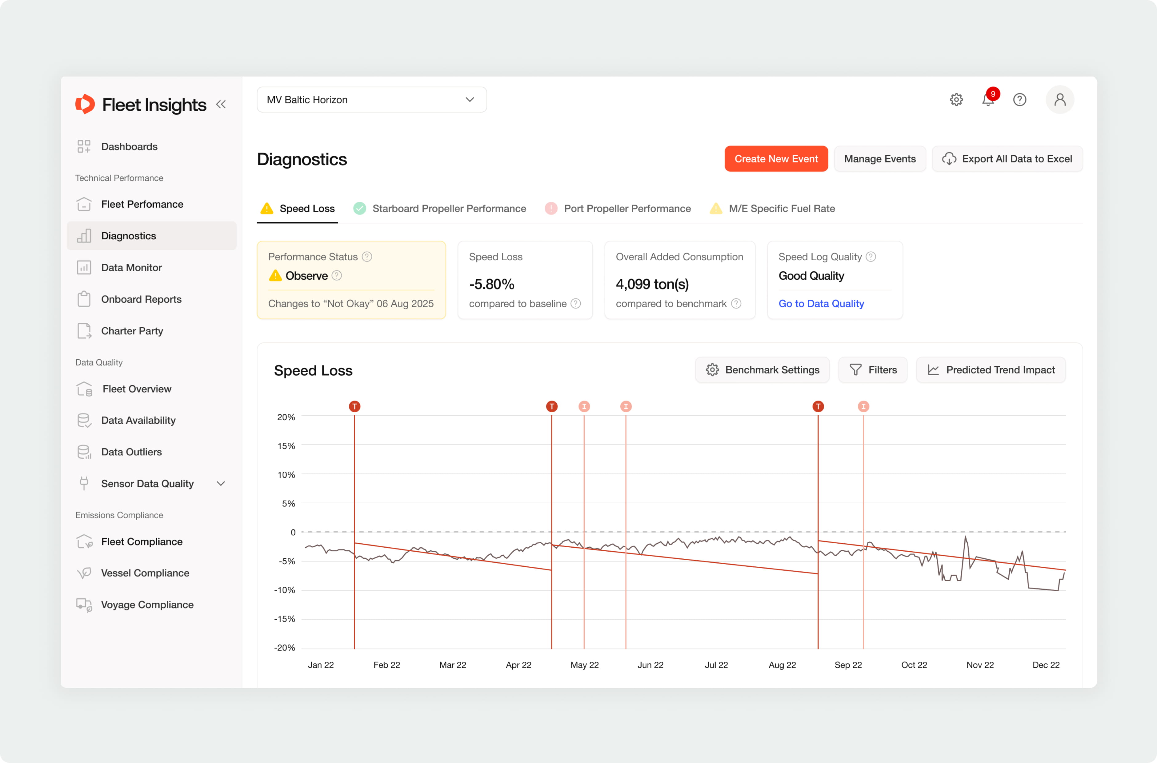
Diagnostics and Fouling Analysis were previously separate modules, even though users often moved between them when investigating vessel performance.
I proposed a unified experience where both types of analysis could be accessed from one place, while preserving the terminology users already understood. This was an important trade-off: fully flattening the modules would have looked cleaner, but it risked making the product harder to understand for existing expert users.
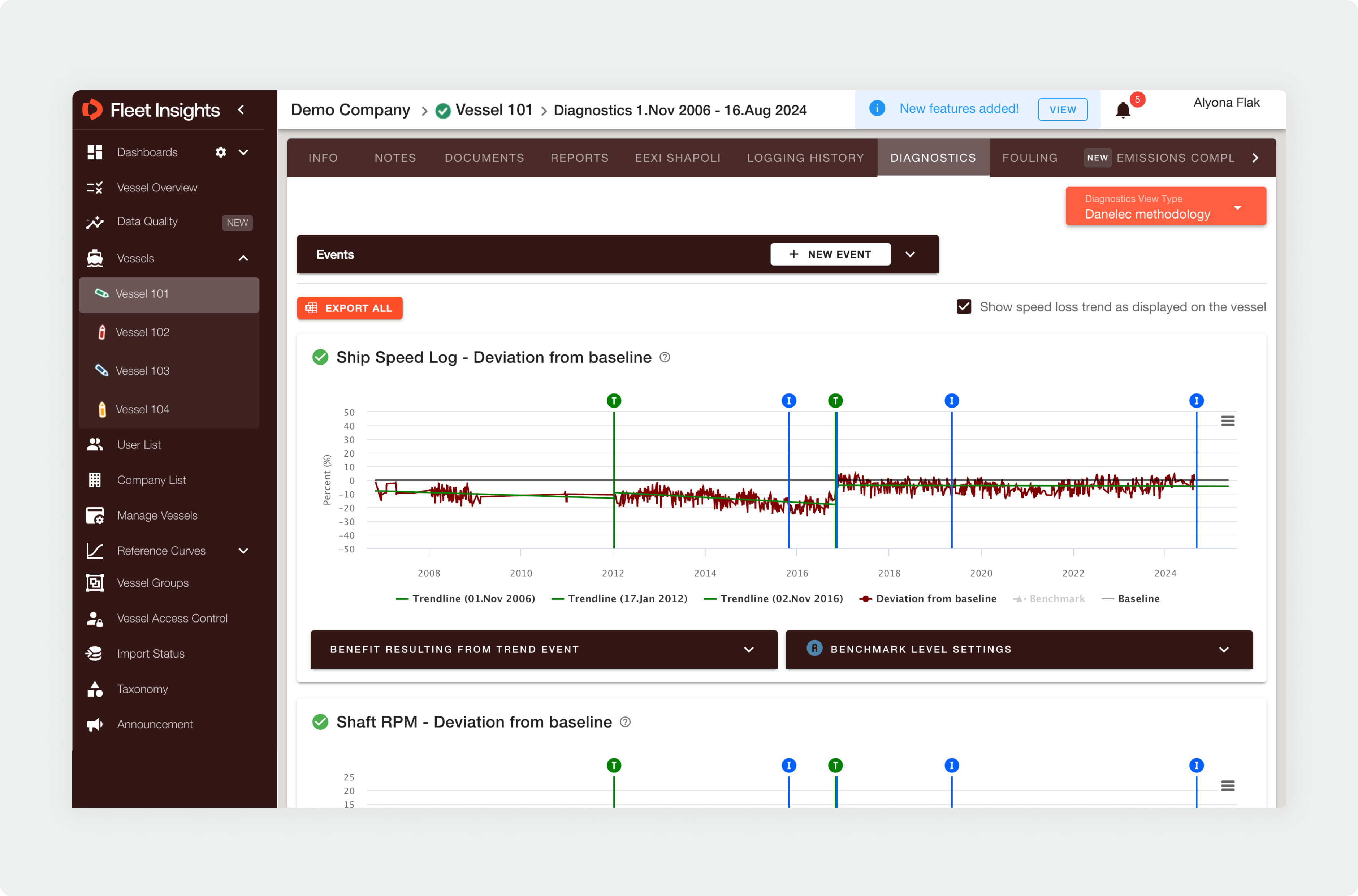
Adapted the rebrand for a data-heavy interface
The new visual identity had already been defined at brand level. My work was to translate it into a usable product interface.
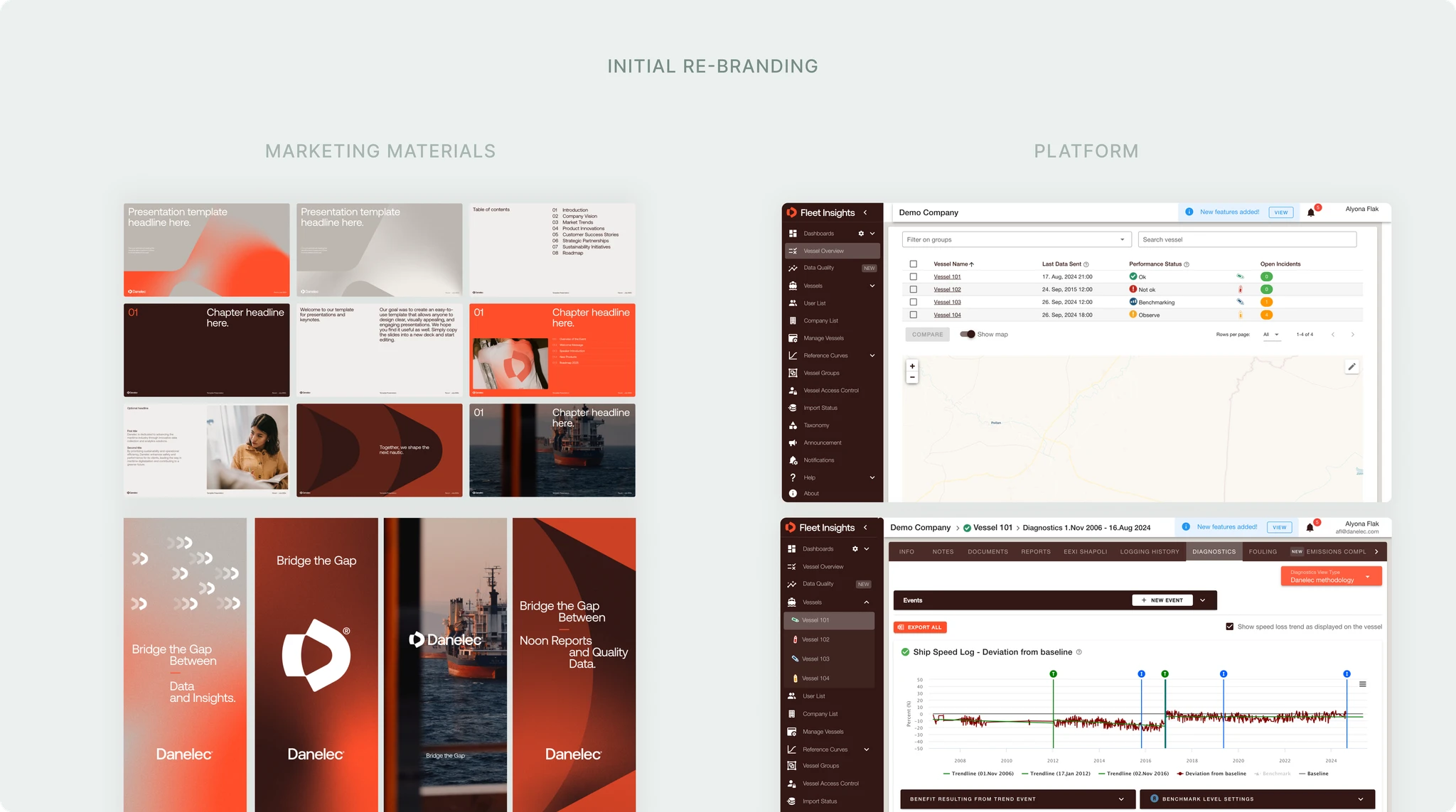
I reviewed colors, typography, contrast, tables, charts, and dense layouts through a product lens. Where brand choices created readability issues, I adjusted the UI application while keeping the overall identity consistent.
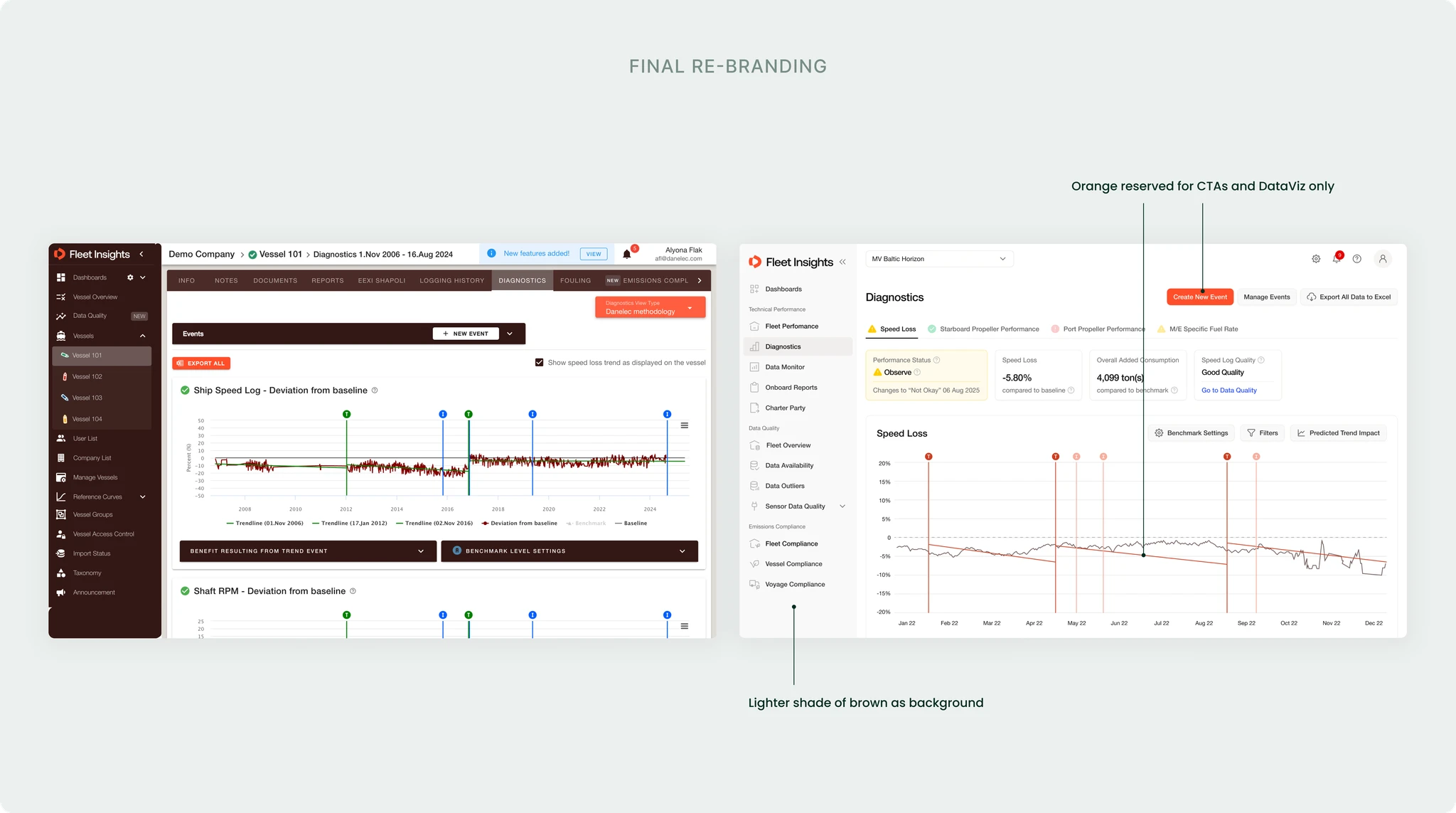
The redesign made key workflows faster and easier to access: