Atobi is a mobile learning platform for retail teams. Companies use it to onboard new employees, share product knowledge, and keep store staff updated.
The existing training experience was built around a format called Missions: short tasks combining content and interactive exercises. But completion was low. Retail workers would start a task, get interrupted by customers or shop-floor responsibilities, and often never return.
My role was to redesign the core training module from concept to delivery. I worked as the sole designer with a product manager and engineering team, defining the new content structure, interaction model, and re-entry experience.
Retail workers rarely complete training in one focused session. They use the product in short moments between other responsibilities. This meant the new experience needed to support interruption from the start.
There were also several constraints:
Designed for interruption and re-entry
The most important design decision was to treat interruption as a core part of the experience, not an edge case.
I introduced a re-entry state called Action Mode. When users returned to an unfinished task, they could quickly see where they left off, what was already completed, and what remained.
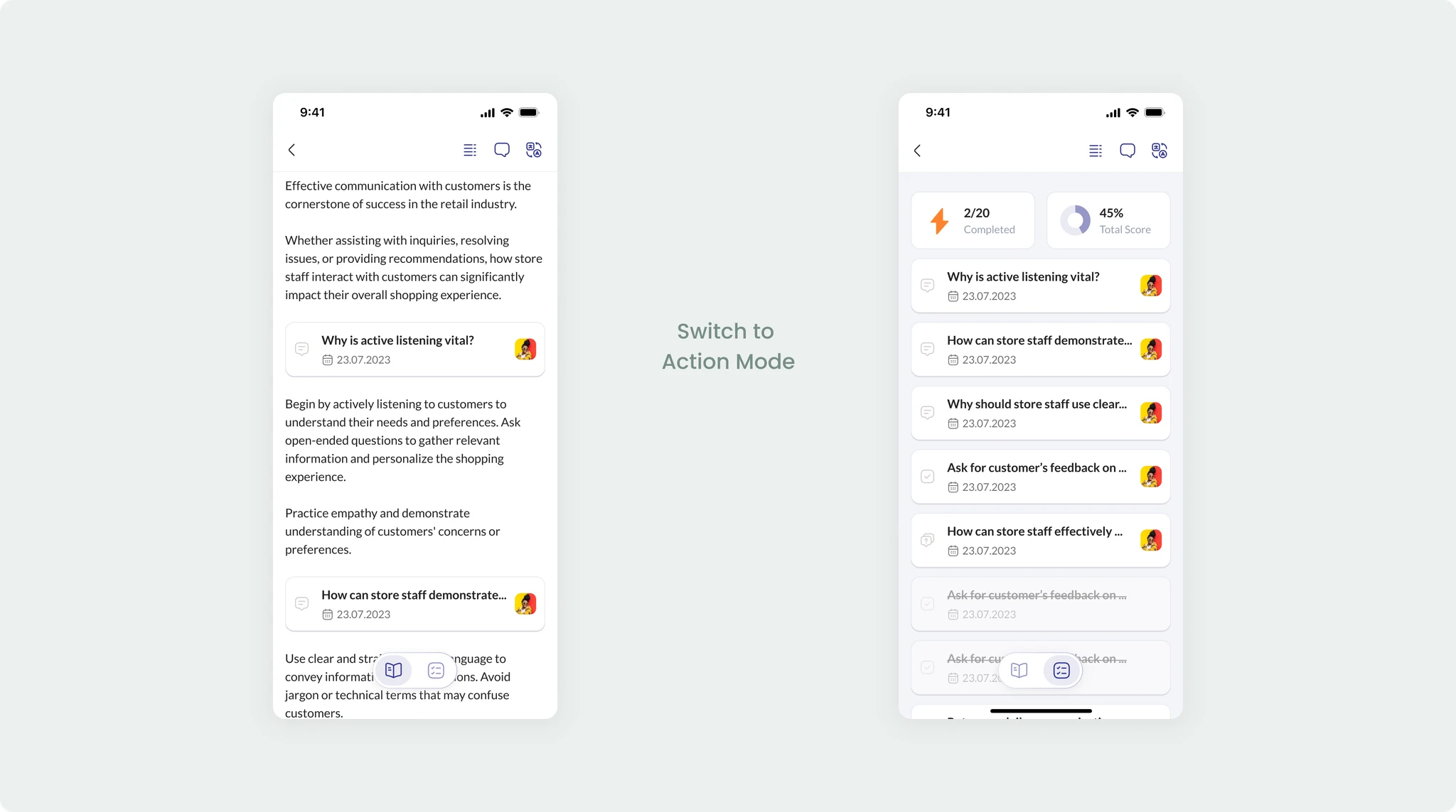
Created a unified content format
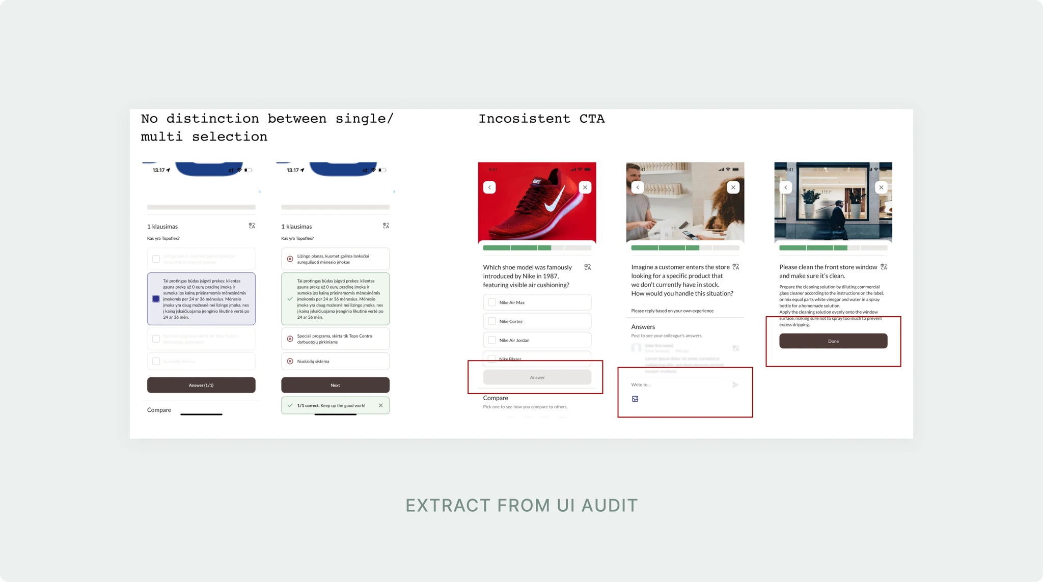
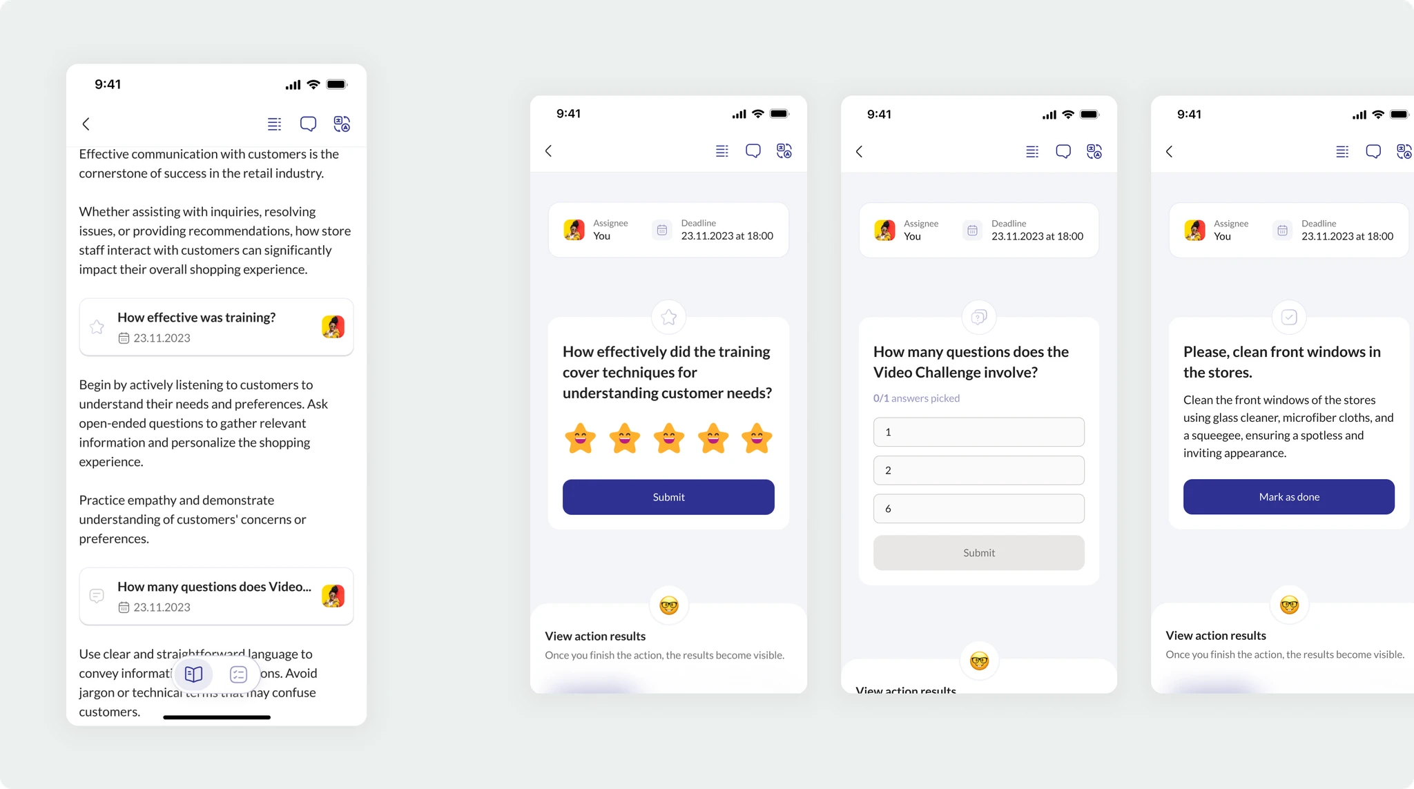
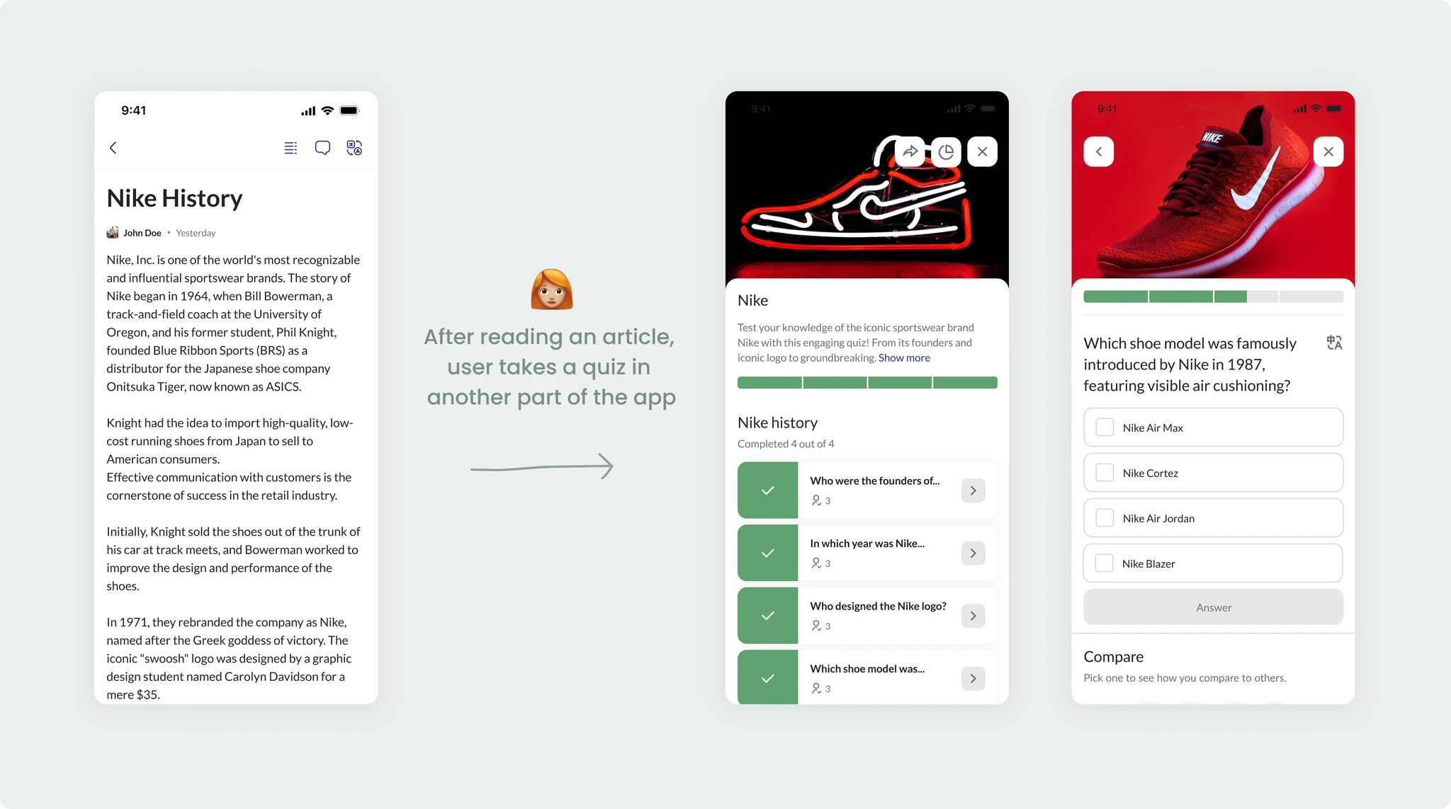
The old experience treated articles and exercises as separate formats. I conducted I conducted competitive analysis of the direct and indirect competitors of the app, and that helped to guide the redesign of more full and unified experience.
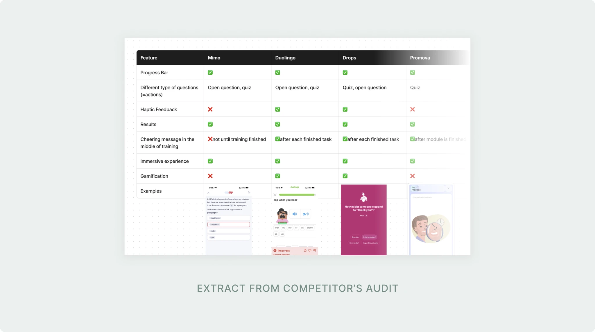
I was experimenting with different ways of incorporating actions into article. The challenge was to keep the existing structure of the article, but at the same time give user an immersive experience when completing the actions.
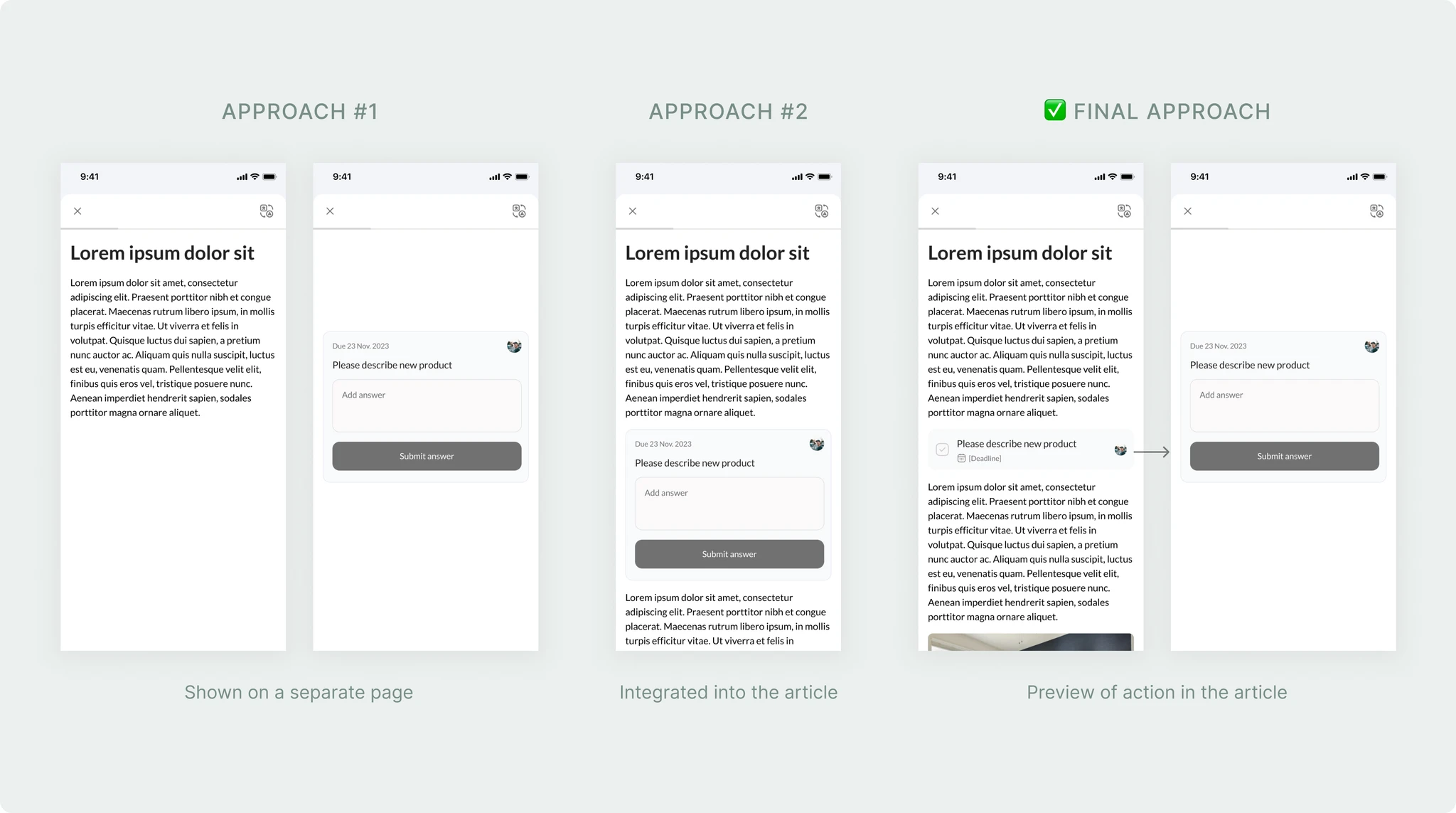
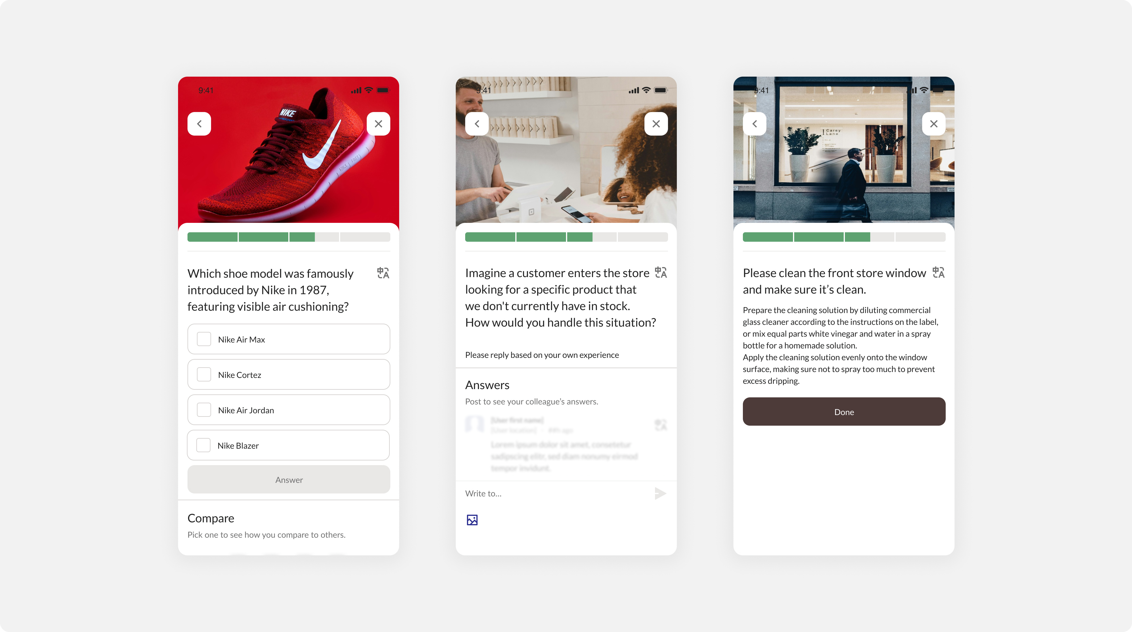
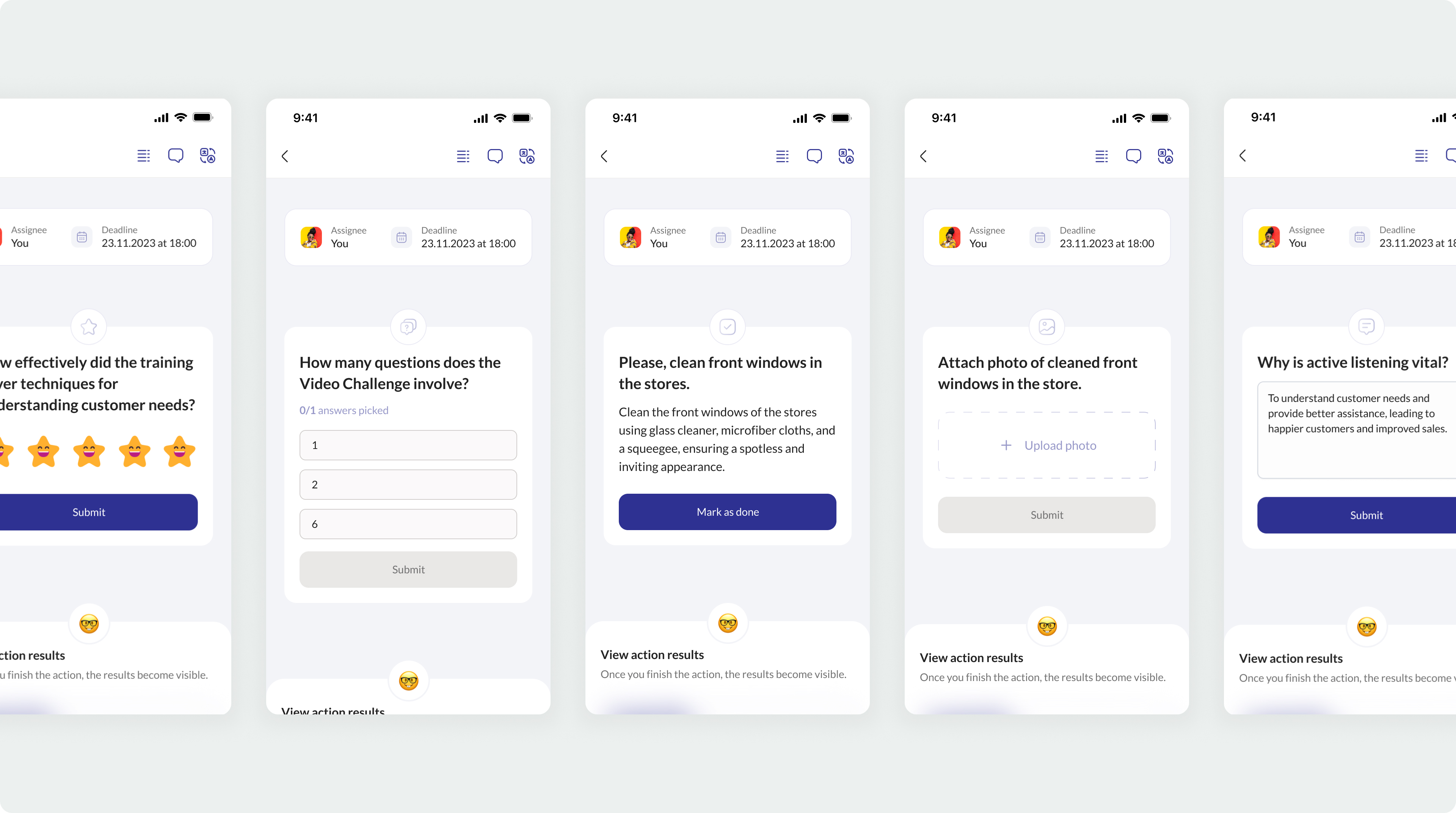
As a result, users could move through different step types — reading, watching, responding, or reflecting — without feeling like they were jumping between disconnected modules.
Kept gamification useful, not excessive
There was internal pressure to add stronger gamification mechanics to improve engagement.
I pushed for a more restrained approach: progress indicators, clear completion states, and warm acknowledgements instead of badges, points, or game-like rewards.
Designed within technical constraints early
Because Atobi was a PWA, I worked closely with engineering early in the process to understand what interactions would perform well on different devices.
Some early animation ideas were cut, but this helped keep the final experience leaner and more reliable.
I could not validate with retail staff at the scale I wanted
Direct user access was limited, so some decisions had to be validated through proxy feedback from store managers, internal stakeholders, and people familiar with retail environments.
We chose restraint over full gamification
More gamification might have made the product feel more engaging in the short term, but it could also have undermined the seriousness of workplace training.
After launch: