Goal
Results
Actions completely replaced Missions (old learning module), resulting in a 387% increase in response rate compared to old learning module.
By engaging in Actions, store staff generated more data and insights for the content creators. This allows them to better analyze the quality of their content and gives the overview of store staff performance.
Research
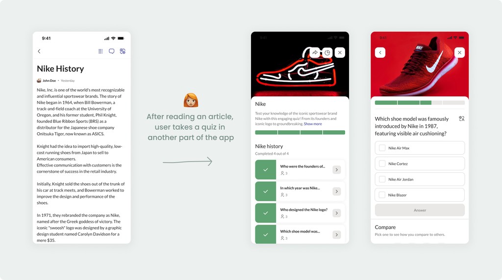
Before the redesign, users passed trainings and read educational articles separately.
Based on the analytics it resulted in low engagement in both - trainings and articles. So, my focus was on improving it.
UI Audit
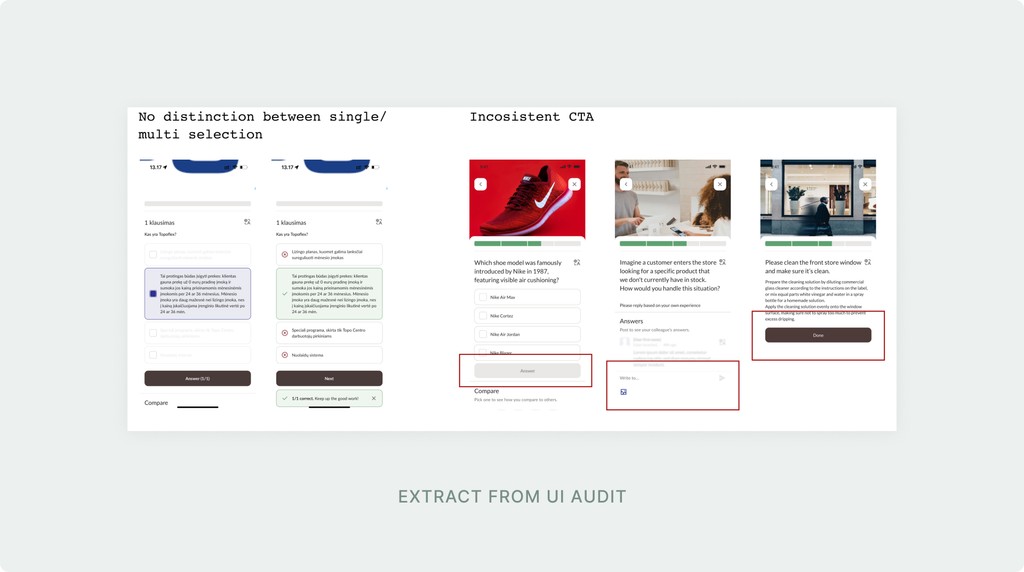
I started with a UI audit of Missions (existing training module). Then, I gathered feedback from the customer success team and users, singling out their key pain points:
Missions are limited to 3 types of questions
Confusing navigation
Inconsistent CTA placement and naming conventions
Confusing system messages (e.g. user wasn't informed that they finished mission)
Competitive analysis
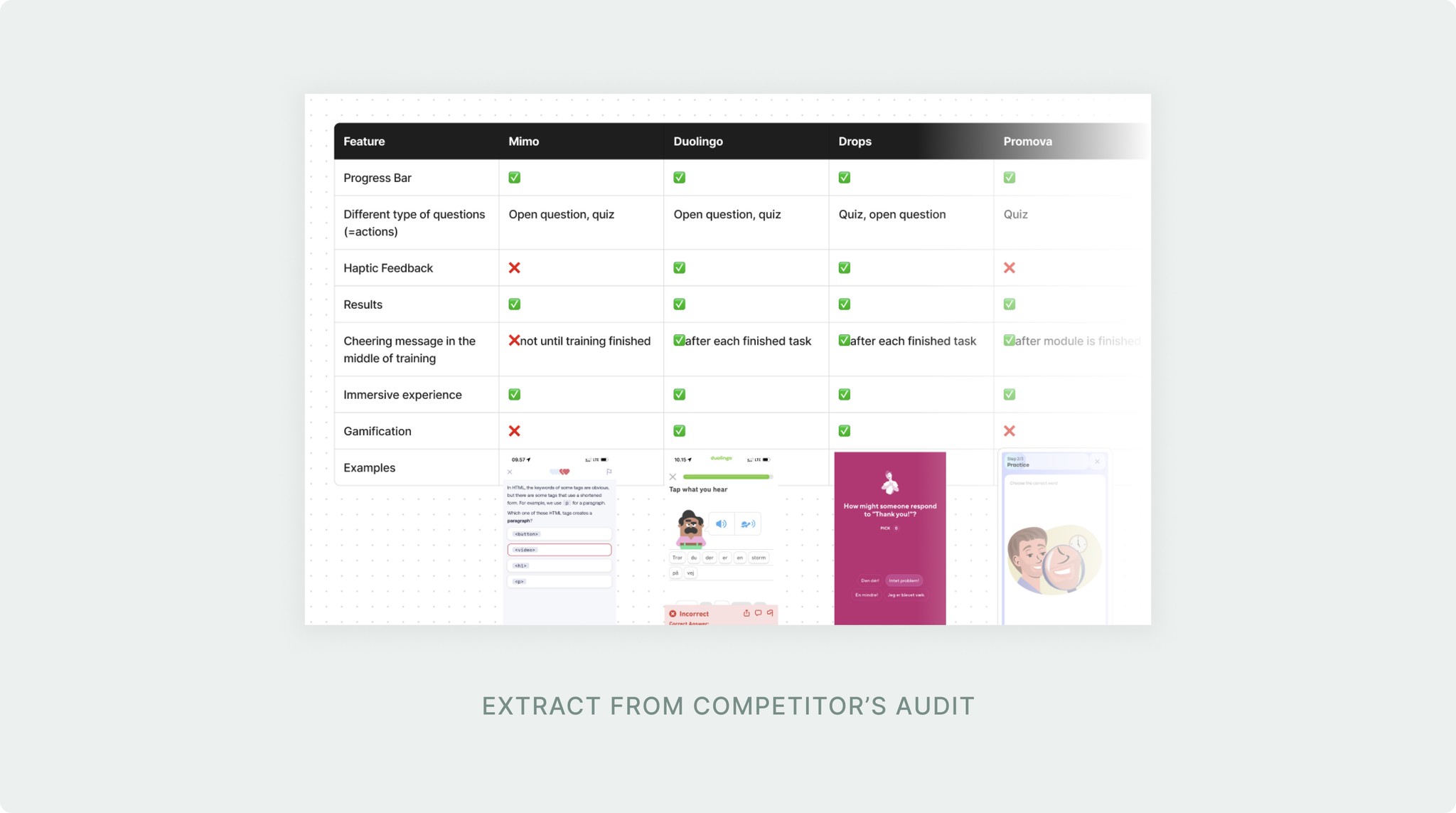
I conducted competitive analysis of the direct and indirect competitors of the app. My key findings can be summed up in the following:
Types of questions were limited to 2-3
Most of them incorporated a form of user encouragement (badges, cheering messages in the middle of training, etc.).
All of them showed user's results after finishing the training and informed about progress during it
Define
Ideation
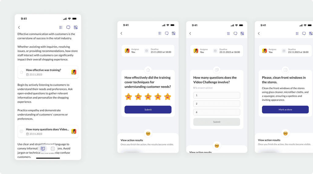
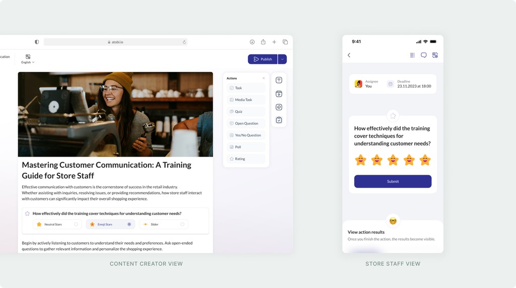
I was experimenting with different ways of incorporating actions into article. The challenge was to keep the existing structure of the article, but at the same time give user an immersive experience when completing the actions.
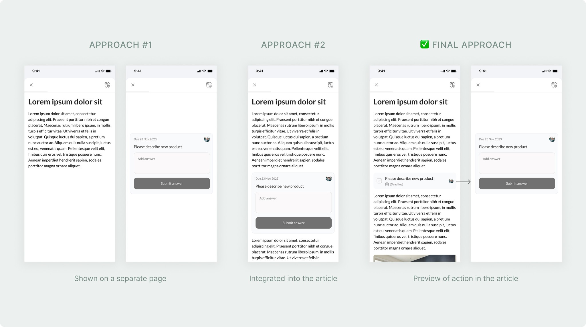
Then, I brainstormed on the action UI itself. The key information repeating across all actions was: assignee name, deadline, actions text and CTA. I also wanted to ensure that the layout is scalable and can be re-used for several types of actions as we planned to introduce at least 7 of those.
Challenge
During the discovery phase, I also researched the specifics of store staff trainings and their work in general. And I faced one major challenge.
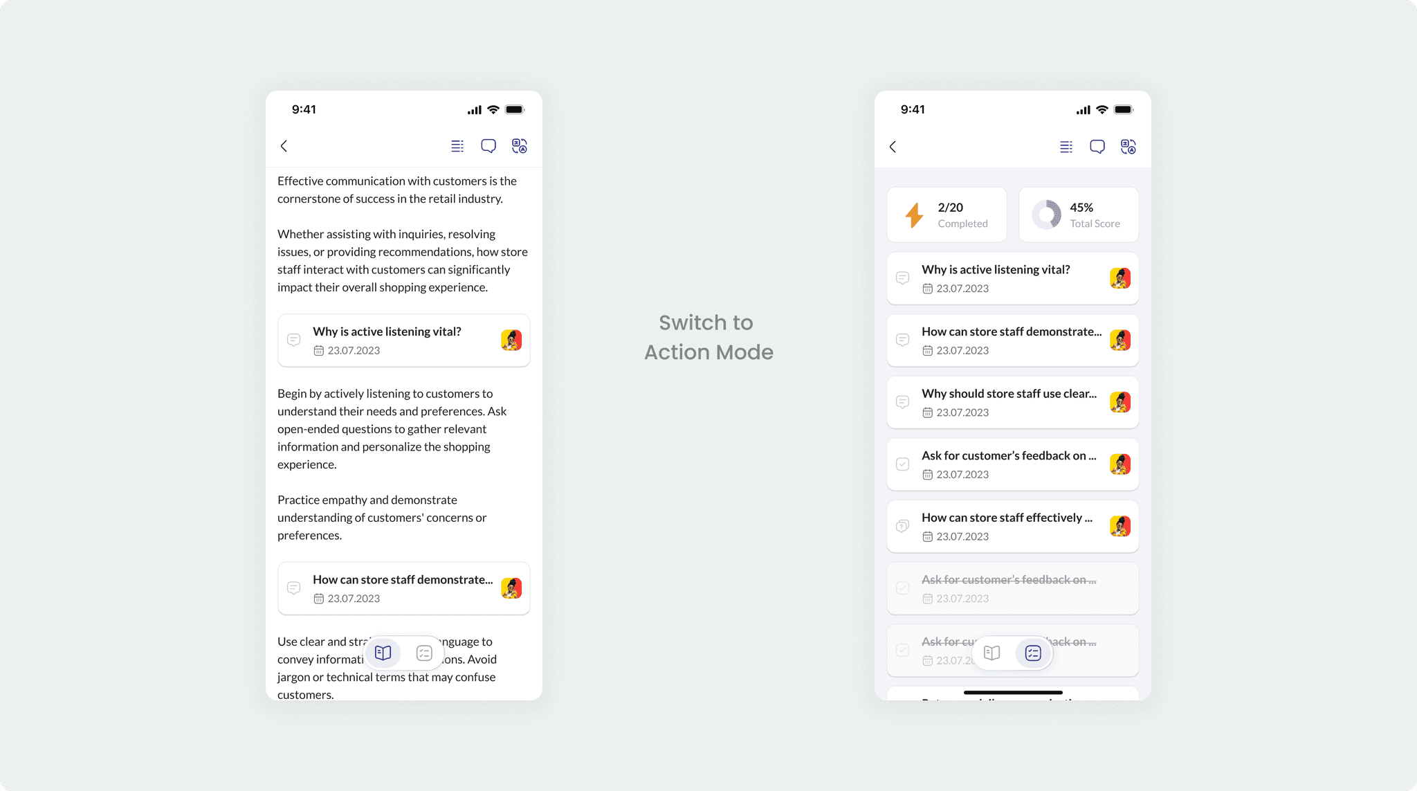
This influenced their attention span and with the new approach we were introducing (actions in the article) they could easily lose overview of them.
That’s how I came up with “Action Mode”. It provides overview of all actions: user’s progress, score and much more.
Results
Overall experience of Atobi became more interactive. App’s adoption increased at least by 7% percent and average response rate is 387% higher compared to the old training system.
Moreover, content creators have gone even more creative, and started using Actions not only as educational tool, but to make operational documents more engaging.
For example, now instead of filling out lots of paper work store staff can easily fill out store checklist sent by their manager (operational document with daily tasks for store staff) in their phone. And possibilities are endless!
